Sample ONE - a line graph
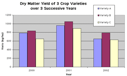
This bar graph shows the dry production of three different crops over a period of three years, from 2000 to 2002. The yield is measured in kilograms per hectare.
All three varieties of crop had their highest production in the year 2001. Also, their lowest production was in 2002. Variety B consistently produced the most dry matter.
Variety A yielded just over 800 kg per area of farming in 2000 and it increased by nearly 200 kg in the following year. However, production dropped in 2002 to around 650 kg per hectare. In the same way, Variety B also increased its production by 200 kg in the first year, but then dropped to just under 800 kg in 2002. Variety C showed a slightly different pattern in that it started at just over 600 kg, then rose in the middle year, yet returned to almost the same level of production, still over 600 kg per hectare.
Over the three successive years, it is clear that there was a spike in production in the middle year, with all crop varieties returning to their previous level or just above.
187 words
TIPS
1. The first paragraph should provide an overview of the graph.
2. Use an appropriate verb – show / indicate / measure / define / describe
3. Use present simple tense to describe the chart
4. Try to show all the ‘parameters’ of the graph – the title, the headings on the y and x axis
5. In this example, the second paragraph describes the graph IN GENERAL.
6. The third paragraph describes the graph IN DETAIL.
7. Don’t just copy numbers from the graph – DESCRIBE them.
8. Practice verb + preposition and preposition + noun collocations
- over a period of three years
- in the following year
- dropped to (amount)
- started at just over (amount)
9. Use a variety of vocabulary for the same idea e.g. yield - production
10. Use one word in its different forms e.g. yield (NOUN) - yielded (VERB)
